Introduction
Every modern manufacturing plant has dashboards. Walk onto almost any shop floor and you will see massive monitors displaying colorful charts, flashing green lights, and scrolling numbers. Despite these visual displays, most leaders still cannot answer basic operational questions when production dips. The screens are on, but the insights are missing.
There is a profound contradiction in modern production. We have more manufacturing data visibility than ever before, yet we are still making critical decisions based on intuition rather than evidence.
What a Factory Operations Dashboard Is Supposed to Do
A factory operations dashboard is a digital visualization tool designed to provide a unified, real time view of production performance, OEE, quality, and machine health. The original promise was simple: give plant managers and operators a single source of truth that eliminates guesswork.
In an ideal world, a production analytics dashboard would allow a team to see a bottleneck forming and resolve it before it impacts the daily target. However, there is a massive gap between what these tools were designed to do and what most of them actually deliver on a Tuesday afternoon when things go wrong.
The Five Reasons Manufacturing Dashboards Fail
Reason 1: They Show Data, Not Decisions
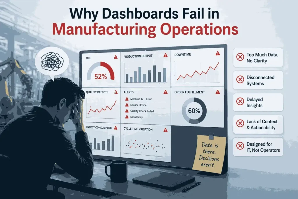
Most factory operations dashboards are purely descriptive. They tell you exactly what happened in the past but do not tell you what to do next. A screen full of raw numbers or historical percentages is not intelligence. If a dashboard shows that OEE is down by 5% but does not explain the specific lever to pull to fix it, it is just a digital scoreboard rather than a management tool.
Reason 2: Dashboard Overload
Too many KPIs built to serve every audience at once end up serving nobody. Operators, supervisors, and executives all require completely different views to do their jobs effectively. When a single manufacturing KPI dashboard tries to display executive financial metrics alongside granular machine vibration data, it creates confusion instead of clarity. Operators eventually stop looking at the screens because the relevant information is buried under a mountain of noise.
Reason 3: Data Arrives Too Late
Most manufacturing reporting tools pull information from ERP and MES systems that update on a rigid schedule rather than in real time. By the time a red flag finally appears on the screen, the specific moment to act has already passed. If your dashboard is telling you about a problem that happened two hours ago, you are not managing a factory. You are performing an autopsy on a lost shift.
Reason 4: Data Sits in Silos
In many facilities, the maintenance team has their own display, quality control has theirs, and production uses another entirely. This creates three different versions of the truth with zero alignment between departments. Manufacturing data silos make dashboards decorative rather than operational. When data is not integrated, the dashboard cannot show the relationship between a machine’s health and the quality of the parts it produces.
Reason 5: No Ownership, No Action
A dashboard without a clear owner and a defined response protocol is just a digital notice board. Most manufacturing BI tools are great at showing a problem but have no built in mechanism to assign that problem to a technician, escalate it to a manager, or track its resolution. Without a clear response workflow, the dashboard becomes background noise that employees learn to ignore.
The Real Problem: Visibility Without Intelligence
The primary issue in modern manufacturing is not a lack of technology. The problem is that most dashboards stop at visualisation and never reach the level of true intelligence. There is plenty of manufacturing data visibility but very little manufacturing decision making data. These tools often answer the question of what is happening but leave the team guessing as to why it is happening or what should be done right now.
A manufacturing dashboard that is not actionable is a liability because it creates a false sense of security. Leaders assume that because they have a production analytics dashboard, they are data driven. In reality, they are just observing problems in higher resolution. To be effective, a dashboard must move beyond descriptive analytics and into diagnostic and prescriptive intelligence. It should not just reflect the current state of the operation. It should actively guide it.
What a Dashboard That Actually Works Looks Like
An effective factory operations dashboard is an active participant in the shift, not a passive observer. It uses real time production monitoring to surface the right metric to the right person at the exact moment they need it, with a clear next action attached.
Instead of showing a generic red bar indicating that Machine 4 is underperforming, an active system identifies the root cause. A high performing OEE dashboard would alert the supervisor that Machine 4 is slowing down because of a specific feed rate deviation and suggest a mechanical adjustment before the shift target is lost. This is the fundamental difference between a simple screen and a comprehensive production performance tracking system. It turns data into a tactical advantage.
Frequently Asked Questions
1. Why do most factory operations dashboards not drive decisions?
Most dashboards focus on descriptive data that tells you what happened in the past. Without diagnostic insights explaining why a problem occurred, managers lack the context to make a confident, immediate decision.
2. What is dashboard overload in manufacturing and why does it happen?
Dashboard overload occurs when too many metrics are crammed into a single view. It usually happens because companies try to create a single solution that attempts to satisfy executives, engineers, and operators simultaneously, and ends up serving none of them well.
3. What is the difference between a passive and an active manufacturing dashboard?
A passive dashboard requires a human to look at it, interpret the data, and decide on a fix. An active dashboard uses manufacturing BI tools to automatically highlight anomalies and suggest specific corrective actions to the right person at the right moment.
4. How do manufacturing data silos affect dashboard effectiveness?
When data is siloed, the dashboard cannot correlate information across departments. This prevents the system from identifying complex problems, such as how a specific maintenance delay is directly causing a drop in quality scores two lines over.
Conclusion
A dashboard is only as valuable as the decision it enables. Most manufacturing plants are not suffering from a lack of data or a lack of screens. They are suffering from a lack of intelligence in connecting the two.
High levels of manufacturing data visibility mean nothing if that data does not lead to a measurable improvement in OEE or a reduction in waste. A production analytics dashboard should be a roadmap, not just a mirror.
At MyDataInsights, we believe your data should work as hard as your machines do. We build factory operations dashboards that go beyond simple visualisation to drive real, profitable decisions on the shop floor. Stop looking at what happened and start seeing what to do next.